Terence Lew explains his concept behind the logo design.
“A humble role to get things done to enhance the lives of people with varying disability experiences”
From my initial research on Equal Dreams and its philography, Equal Dreams’ critical role is to minimise client’s uncertainty to persons with varying disability experiences to work on progressing their business or events.
“Say less, do more” plays a vital role in ensuring Equal Dreams stay visible, simple and focused in providing the best ability for accessibility services.
By minimising the uncertainty and unnecessity of Equal Dreams unknown to their clients, we can embrace the power of having an understated, quiet yet powerful presence that is very confident in supporting businesses by providing a wide variety of accessibility services.
KEYWORDS: VISIBLE / UNDERSTATED / SUBTLE / CONFIDENT / SIMPLICITY / DIRECT
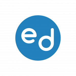
Circle interacting inside e and d defines the projection of a positive emotional message to show the whole community towards people with disabilities, building wonderful friendships, engaging relationships with vendors and unity.
A more illuminated blue colour evokes a feeling of the self-drive of professionalism, trust and reliability for Equal Dreams to deliver their best quality services for accessibility and programmes.
Adopted by Gestalt theory when designing this logo, it defines hold that the human brain unifies the visual elements it sees to form a whole that carries significantly more meaning. People form patterns out of similarly shaped objects, while objects that differ from the group become a focal point of the image. So, in other words:
1) e and d can be exhibited seamlessly as e and q to describe equality able to tap on accessibility for the different range of disabilities no matter what who you are;
2) e and d bring a subtle, compact 3D pop envisioning if e and d are interrelating one another in terms of using hands for sign language interpreting and notetaking at one go – showcasing some of Equal Dreams’ core accessibility services
e represent a person tapping on digital services for accessibility and even evolving the quality of their accessible services through various platforms digitally;
3) positive arrow in diagonal position of e and d unfolds the empowering people with disabilities, “e” pushing “d” to achieve with their needs and wants to enhance their quality of lives in learning or sharing digitally.
![]()
Logotype uses a low contrast typeface that has been reduced to reflect simplicity. It is to ensure the identity does not feel too distant and clinical; rounded corners soften the visual impact and are friendly at the same time. Horizontal text insinuates community, tranquillity and steadfast.
In summary, the logo unveils Equal Dreams organisation to become a stronger intrinsic element in the message it will convey efficiently to clients and the wider public locally and internationally.
Terence Lew
Singaporean award-winning designer raised in Singapore and worked over 22 years as an art director, creative director, communication strategist and data analyst in different organisations locally and overseas such as Singapore Management University, Walz Solutions, USPS, Havas Worldwide and EURO RSCG etc. To the extent that I can be pretty considered as a “Jack of all trades” on Design related or attaining towards a “polymath” one day able to teach UX/UI design / human-centric interaction in institutes of higher learning. Hopefully?
PS4 Gamer, Resident Evil fan, Domokun collector, IT gadget addict, a former triathlete/ironman, dragon boater and rock climber, a former sign language instructor and a SUSS graduate with first-class honours in BA of Visual Communication with Business; almost killed me. Really yes. Currently, a goofy scholar without any expectations at all studying Master of Management in SUSS will be graduating in one year and half years.
I am a senior UX/UI designer specialising user interaction and strategy in the telecommunication industry for six years. Presenting at the delightful spot among uniformity and style to craft experiences that go beyond Design regardless of online (mobile, interaction etc) or offline (print and strategy). I also love to deliver at the fulcrum of simplicity and intellectual purity to craft delightful brand experiences. I am producing the nexus of innovation and sustainability to save the world from a bad design with accurate answers. Nothing attempted, nothing earned.
Well, Design Thinking is becoming quite the buzzword in the late stage of the 2010s. It is a rational approach to innovation to develop creative ideas that unite people’s needs in my jargon.
So, Design is a kind of fuzzy word defining what you want to tell or share, and depending on the conditions; it can discover so many various elements. Some see Design as aesthetics, some as essence and others as functionality. Though hard to define, Design typically has three keys: system as an object, set up as a service and Design as a process. With it, you might come across Design in all three of these aspects. Design Thinking combines industry and design mindsets into an overall human-centred approach to innovation, developing pleasing, economically viable, and technologically achievable ideas.
It has become apparent that using Design in several steps and on a strategic level produces an ambitious position, boosts innovation dimensions, supplements value across the complete value chain, and changes the bottom line. It also offers innovation based on current information, leading to new business models, and in the end, a better bottom line.
The design community still fights to find a common denominator when outlining what design thinking is. Nevertheless, its innovative approach, tools, and structures have helped me to succeed. I am still learning to discover different design aspects online and offline until now and build understanding and communication with my design team and stakeholders.
Even though there is no right or incorrect way of implementing design thinking, people must always reach first. Since individuals design solutions for other humans, the “people” variable will be present in every design experience. Understanding, therefore, is essential to building better solutions. Without it, the human element of the process will weaken, and there is a lack of experience of the user’s requirements.
Discovering Design is iterative, and you demand to be informed regarding it. Hastening to a solution when the problem is not precisely explained will lead to wasted resources; if inevitable teams should not be worried about commencing. By requesting more further “whys,” one build better “whats.“
Design thinking is a complex methodology that supports you to innovate and resolve problems by building value to team members — or design intellectuals — and stakeholders alike. I will feel empowered as a deaf individual/employee with my most reliable design team. I also am involved sympathising with the people all are trying to help, and stakeholders — customers, managers, other employees, suppliers, etc. — experience joy when a well-defined problem meets a well-executed solution.
In short, I aim to investigate overall design processes —and design itself— as a non-dogmatic practice. I am stressing the form, stretching the concepts up to corrupting rules, addicted to pixel measurements, and “misuse” of different tools. I like to conceive user needs as a system and medium. I specialise in UX/ UI modular systems, interface design and art directing online and offline. My humble superpower is a constant drive to retain possible solutions very manageable, both in format focusing on the user journey to execute the best solutions.
I will love to share with you about the junction of simplicity and purpose to craft experiences beyond Design to make your Design for your brand more sustainable efficiently. Let’s chat, I reckon?
Catch up with you then.
Designer saved Equal Dreams by logo
You can reach him at his email: terocker@gmail.com.


